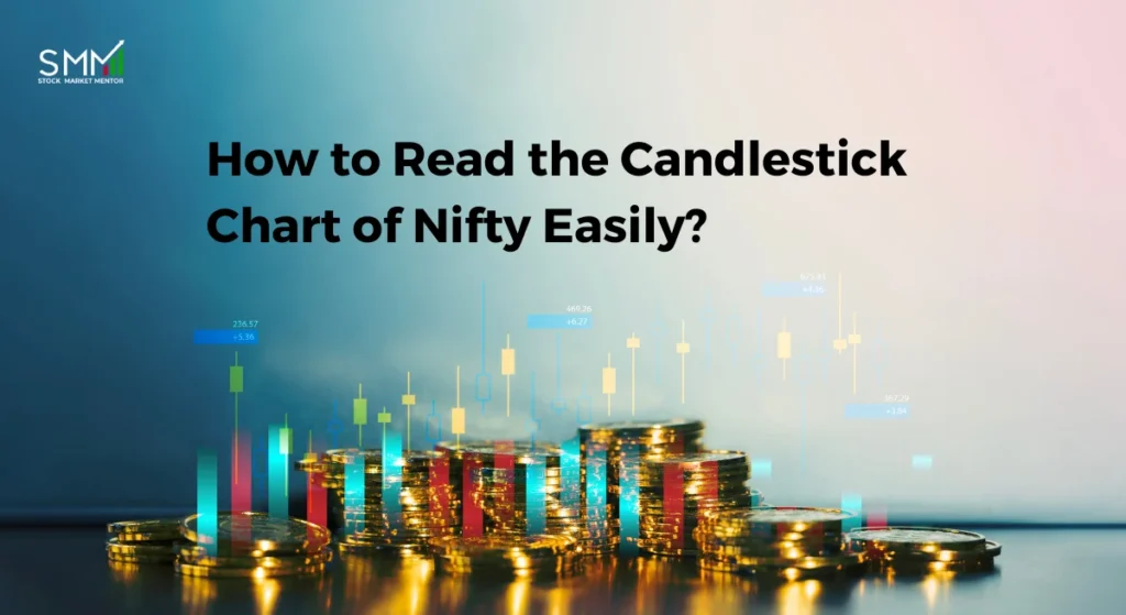
If you’ve ever opened the candlestick chart of Nifty and felt like you were staring at a bunch of random red and green blocks, you’re not alone. Most traders start there. The chart looks confusing at first, but once you understand how each candle works, the whole market starts making sense.
Candles don’t have magical powers. These just show you who was better at that time, the buyers or the sellers. Once you know how to read them, you can see trends, reversals, and market power for sure, without having to guess.
In this blog, we go through it step by step so that you can confidently read Nifty candlesticks, even if you are new to trading.
What Is the Nifty 50 and Why the Candlestick Chart of Nifty Matters?
The Nifty 50, also known as the Nifty, is India’s benchmark stock market index on the National Stock Exchange (NSE). It shows how well the 50 biggest companies with lots of available cash on the exchange are doing, and it includes important parts of the business. Many traders also compare Nifty’s movement with other benchmark indices to understand relative strength, and this comparison between Nifty vs Sensex often gives better clarity on broader market direction.
The candlestick chart of Nifty is followed by investors, traders, and experts to observe the movement of the price over time and the changes in market sentiment from buying to selling or the other way around.
For example, the latest market action shows the Nifty around 26,200 and moving toward new highs because of broad inflows and good market signals. This is one of the data points that shows why it’s important to understand these candlestick movements if you want to understand India’s markets.

What a Candlestick Really Shows on the Candlestick Chart of Nifty?
A candlestick is a simple way to see how the price moved during a specific time period, it could be 1 minute, 15 minutes, 1 hour, or 1 day. When traders study the candlestick chart of Nifty 50, the daily timeframe is the most popular to look out for because it gives clear signals.
Each candle shows four types of prices:
- Open: where the price started
- Close: where it ended
- High: the highest point reached
- Low: the lowest point touched
The candle goes green if the close is higher than the open. It turns red if it closes at a lower value.
The body is the thick part, and the wicks are the thin lines above and below the body. When looked at together, these show how the people buying and selling were able to change the price during that time. These price rejections often happen due to liquidity build-up, and understanding what liquidity means in trading helps traders read why prices reverse from certain levels.
If you want to learn more about Nifty and trading strategies from experts, check out our courses here.

How to Read the Candlestick Chart of Nifty Step by Step
Here’s how you can read the candle chart of Nifty in a simple, step-by-step way so you understand what the market is trying to say.
Start With The Body And Colour
A green candle shows that the price is higher than it was when it started. A red light means it went down. A big body means that a lot of people are buying or selling. The move’s strength was low because the body was small.
Look At The Wicks
A long upper wick means buyers tried pushing the price up, but sellers pushed it back down. A long lower wick means that sellers tried to drop the price, but buyers fought back and pushed it up again. Wicks tells you who controlled the extremes.
Spot Key Single-Candle Signals
- Doji: open and close are almost the same. This shows hesitation.
- Hammer: appears after a drop, with a long lower wick. Buyers step in strongly.
- Shooting Star: appears after a rise, with a long upper wick. Sellers rejected higher prices.
Pause and check today’s Nifty chart.
Can you spot:
A candle with a long lower wick near support?
A small-bodied Doji after a strong rally?
Ask yourself: Who tried to control the price and who failed?
This simple habit builds real chart-reading skill faster than memorizing patterns.
Add Basic Patterns To The Picture.
- Bullish Engulfing: a strong green candle covers the previous red one. Buyers are taking over.
- Bearish Engulfing: a red candle covers a smaller green one. Sellers are gaining control.
Read It With Context
A hammer near support means more than a hammer in the middle of a sideways move. A bearish engulfing near resistance carries more weight than one in the middle of a trend. Professional traders also combine candlestick signals with broader Indian stock market chart patterns to avoid acting on weak or isolated signals.
Check Volume And Timeframe
Patterns backed by higher volume are stronger. And signals on the daily chart matter more than those on shorter timeframes. Momentum indicators such as RSI are often used for confirmation, and tools like the RSI divergence indicator can strengthen the reliability of candlestick signals.
Wait For Confirmation
Let the next candle move in the same direction as the pattern. This helps avoid guessing too early. Confirmation is also where disciplined traders apply structured risk control using proven risk management tools for stock market traders.
If you want to go deeper into how different types of investors approach the market and how their behaviour impacts price, check out this detailed guide on types of investors from our training sessions.
Quick Recap: How to Read a Nifty Candle in 10 Seconds?
Use this quick checklist every time you open the candlestick chart of Nifty:
- Every time you view the Nifty candlestick chart, use this brief checklist:
- First, determine whether the trend is sideways, upward, or downward.
- Examine the candle’s body size (buyer or seller strength).
- Examine the price rejection zones, or wicks.
- Take note of the location (breakout area, resistance, and support).
- Verify using the subsequent candle and volume.
The candle is worth keeping an eye on if these five criteria line up. If not, waiting is preferable.

Using Timeframes and Context to Read Nifty Candlesticks
Nifty looks different depending on the timeframe you check:
- Intraday traders watch 5‑ or 15‑minute charts.
- Swing traders focus on daily charts.
- Long-term investors track weekly charts.
Patterns on higher timeframes are usually more reliable. For example, a Doji on a 5‑minute chart might not mean much, but a strong engulfing pattern on the daily candlestick chart carries weight.
Candlesticks are most effective when viewed in a larger context. Pay attention to the:
- Trend: Is Nifty going up, down, or sideways? Bullish patterns are stronger when the market is going up, and the negative patterns are stronger when the market is going down.
- Support and Resistance: Patterns that are close to these levels are more important because the price tends to change here.
- Volume: Moves that have volume show real power and confidence.
When you combine timeframe, trend, support/resistance, and volume, the candlestick pattern of Nifty starts telling a clear story. Many losses happen when traders ignore this multi-timeframe context, which is one of the most common reasons behind repeated stock market losses.
A Practical Example from the Daily Candlestick Chart of Nifty 50
If you look at a recent daily candlestick chart of Nifty, you can see how the index makes clear patterns around the major levels. For example, after going down for a short period, Nifty usually makes a hammer or positive engulfing candle close to a support zone. This shows that buyers are becoming confident again. When Nifty goes up quickly, you might see Dojis or shooting stars near the resistance. These are signs that the move may not last.
Watching how candles change at key levels in real time shows you how the price changes. After watching for a couple of weeks, you begin to understand how Nifty behaves in different situations. This hands-on training is more useful than pattern memorization.
Live Nifty 50 candlestick patterns and charts can be seen here. This kind of real-time observation is exactly what is taught in structured programs such as our practical share market course in Delhi, where traders learn to read live charts instead of memorizing patterns.
Mastering the Candlestick Chart of Nifty for Consistent Trading
Understanding the candlestick chart of Nifty doesn’t happen overnight, but it’s worth the effort. You can get to know the market’s movements when you pay attention to patterns, trends, support, resistance, and volume.
If you want to learn more and get some practice with help, websites like Stock Market Mentor give you tips and examples that make it easier and more effective to read candlesticks in the market.